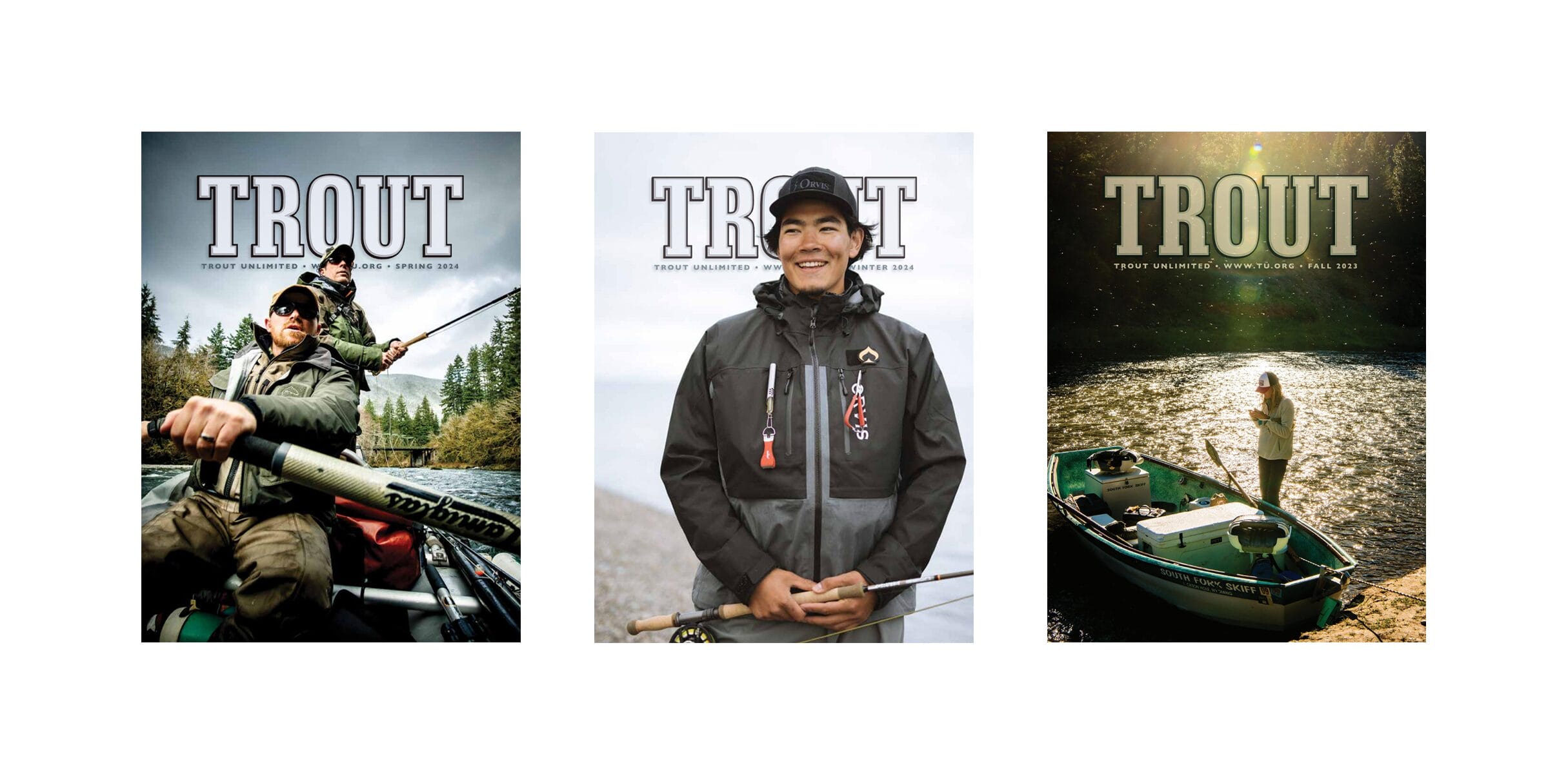
They say you cannot judge a book by its cover, and I believe that. But I think it’s a whole different ballgame when it comes to magazines. Granted, that game is changing in this era, but when it comes to printed periodicals, covers still matter. As an editor, I can tell you that the cover is where you reveal your motives, your mission… your soul.
It used to be all about eye-catching appeal, right? You’d walk up to a magazine rack in a bookstore, an airport newsstand, or somewhere like that, and what was on the covers of the hundreds of magazines you faced played a huge part in influencing what you decided to pull down and flip through. If we could get you to pick it up, we were half-way home to getting you to buy it.
With TROUT magazine, we have a lot more flexibility. After all, as a member, you get the mag whether you want it or not (fortunately 90% or more of you say it’s the number-one thing you most look forward to receiving from TU on a quarterly basis). But it’s very, very important to me and the TROUT staff, that, when that magazine shows up in your mailbox, you take notice. Because if you dig the cover, you’re going to go leaf through it, page by page, maybe even read it front-to-back. And that’s the ultimate goal.
I’ve found it interesting to see how the covers of TROUT have transitioned through the years. I respect the work of my predecessors, and I think the covers reflect how TU has evolved as an organization.
Here’s the very first…
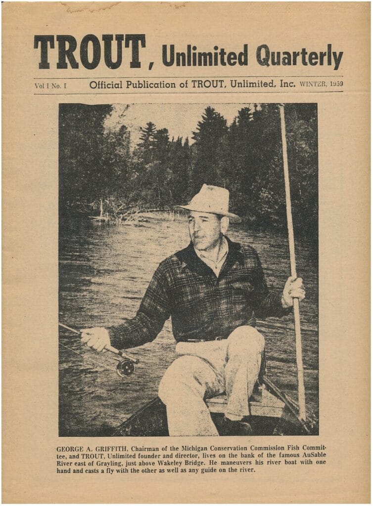
That issue was printed in a broadsheet format, like a small newspaper, and it rightly paid homage to George Griffith, who played a key role in starting it all.
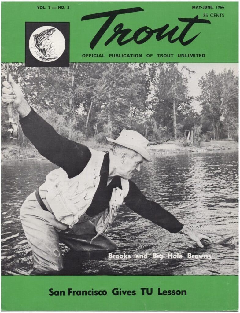
As TU grew, we became a real magazine, featuring icons of trout fishing, like Joe Brooks.
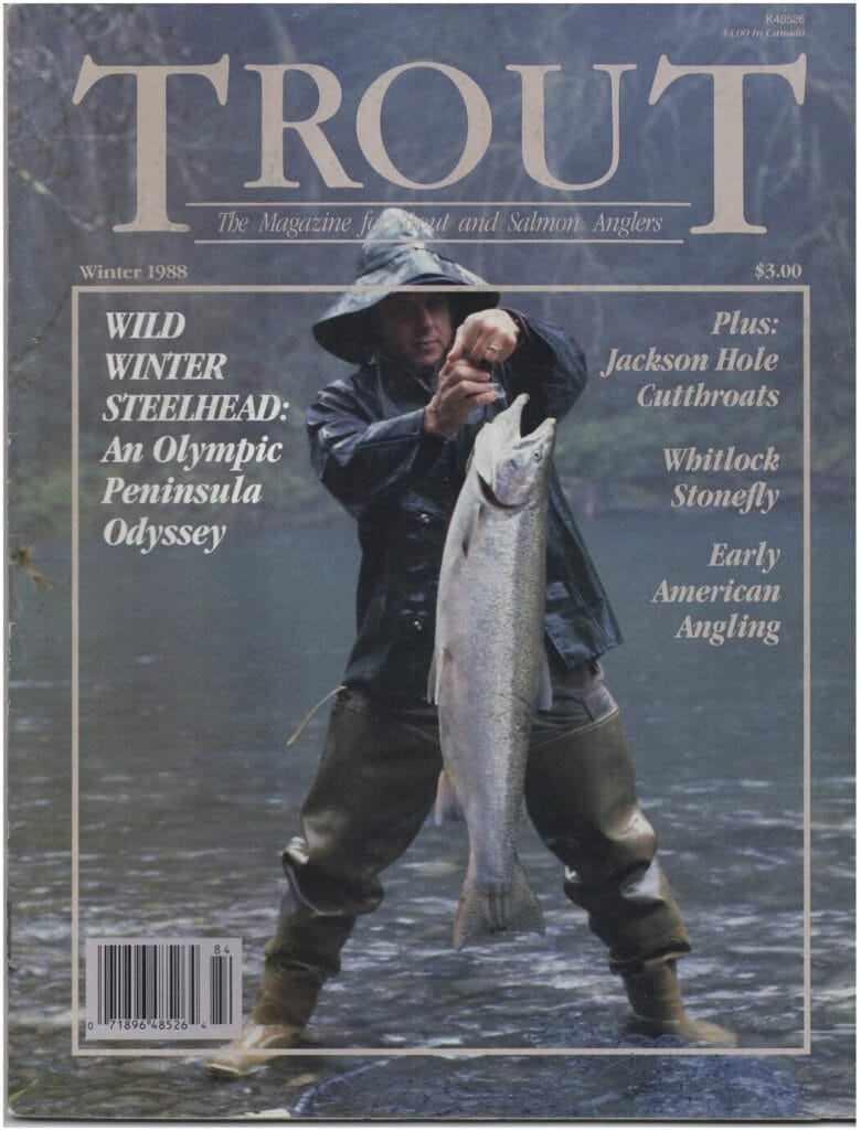
Of course, angler attitudes and fishing practices have also evolved over the years. This one, from 1988 probably won’t be re-used by Wild Steelheaders United any time soon…
By the 1990s, we started the conscience factor, and catch-and-release took hold…
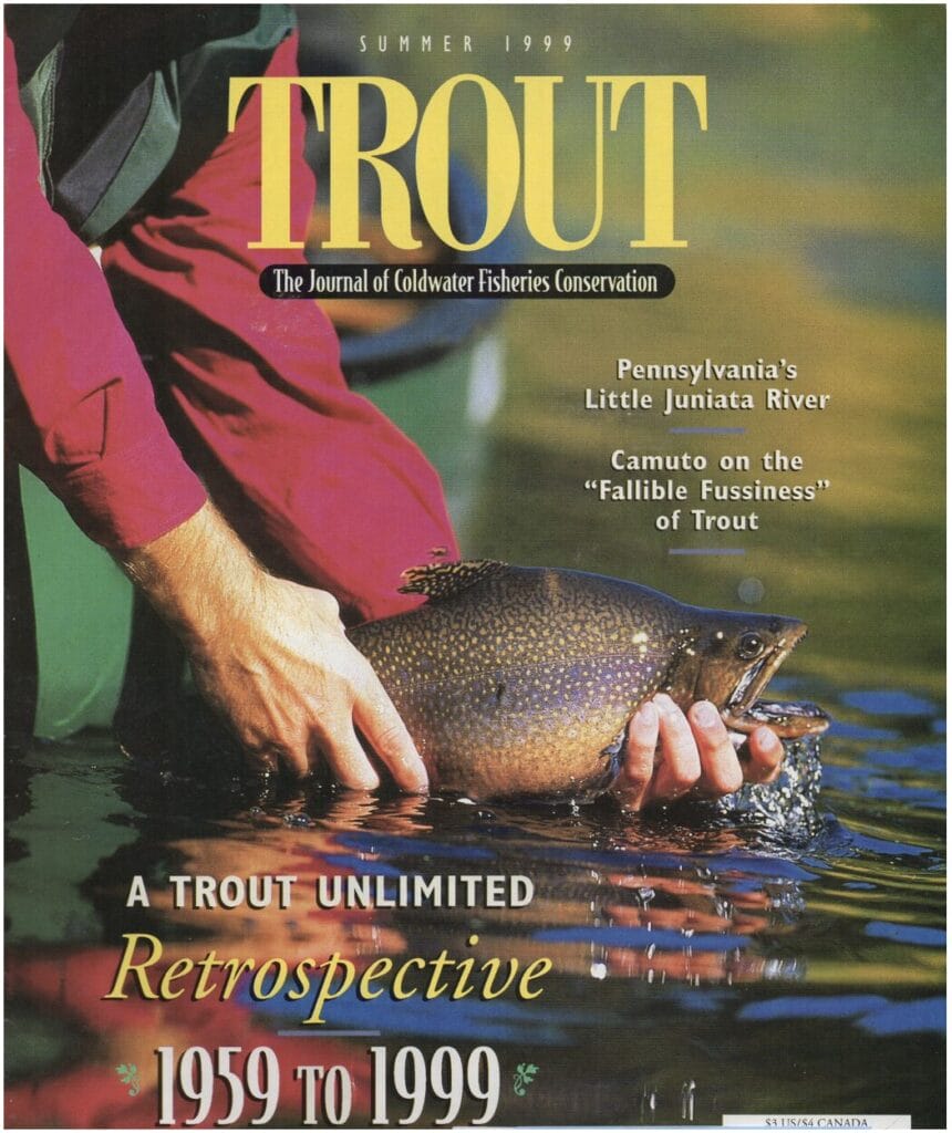
I have been the editor of TROUT since 2012, and I can tell you that there’s a “backstory” behind every magazine cover we’ve run.
The first thing we did was take all the words, bar codes, mailing addresses, and such—all but the title copy—off the cover image. We wanted you to focus on people, places and experiences.
You probably never realized it, but we ran a string of covers of TROUT that didn’t show a single trout on the cover of TROUT magazine for at least a couple years. It wasn’t accidental. We wanted readers to key on people and places that make trout fishing possible in the first place.
We make a point to commission original art that highlights talent and tells personal stories now and then…
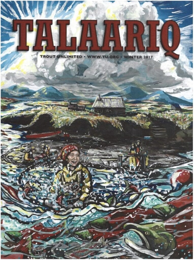
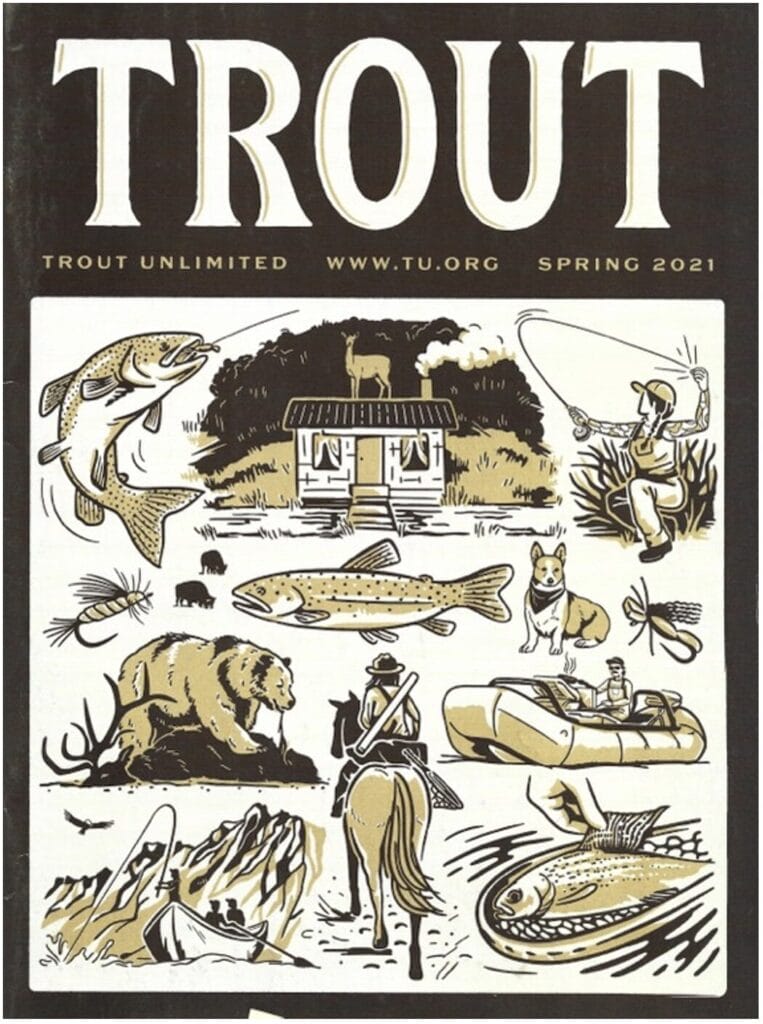
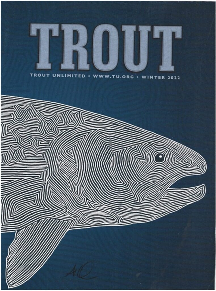
And we pay homage to the greats, like Dave Whitlock, who meant so much to TU, TROUT and fishing in general…
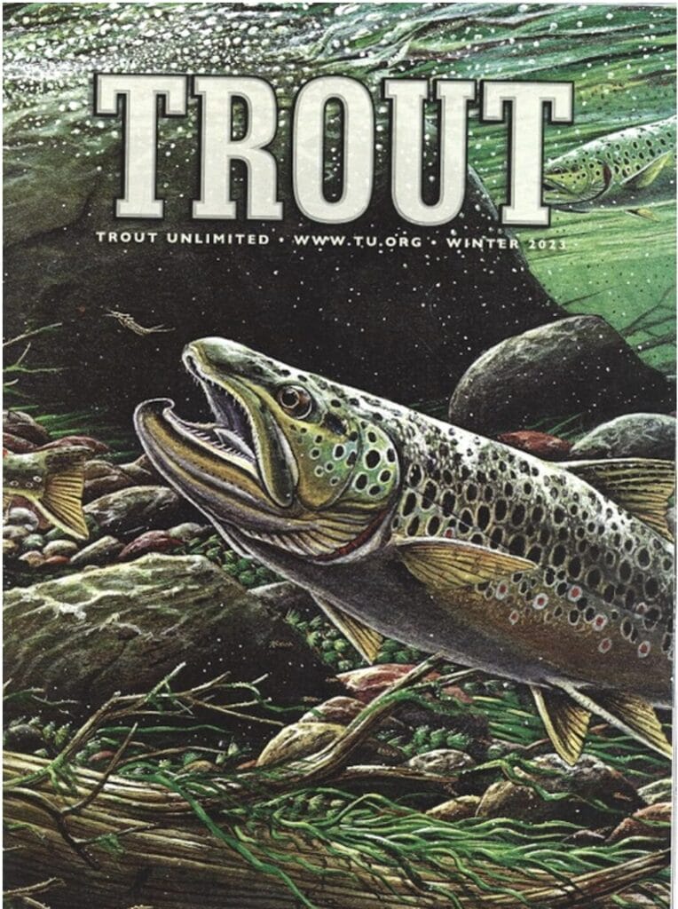
And sometimes we just want to get people fired up, especially when the image is so darn good, we immediately know it belongs on the cover…
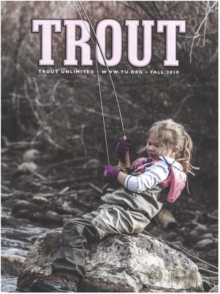
For those of you who wonder, the process is simple. I send the stories to our art director, Jim Gray, and in a few weeks, he hits me back with about 10 different options. Sometimes, I just choose. Sometimes, I invite a “guest picker.” Ironically, in 48 issues, I have yet to invite Chris Wood to guest pick a cover (I’ve found it much more fun to surprise him), but maybe I should.
We don’t do grip-n-grins as a matter of habit. That’s not our bag, and others do it very well, with good reason (curb appeal). We respect them. In fact, I’m often very jealous of the other wonderful covers I see on The Drake, The Flyfish Journal and many other magazines. I think that’s ultimately a good thing that pushes us all to higher standards and serves trout fishing better.
But at the end of the day… yeah… covers matter. And all of us who work on TROUT magazine, hope you take notice, crack a smile, appreciate that there’s a lot of thought that goes into them, and then we hope you go dig into the magazine and the extremely high-level work you find on the pages.
It’s an honor… a big responsibility… and a joy to make this magazine—and choose the covers—for all of you.


